[This article is part of a series of Food+Tech Connect 2011 Trend Reports. Others in the series include Recipe Websites, Apps & Publishing and Where Does Your Food Come From?][...]
19 Dec 2011
5
UncategorizedCommunity Supported Agriculture (CSA) helps farmers around the world share the risk and bounty of their harvest with those in their region. But what happens when your “community” [...]
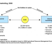
Local food seems to be all the rage - but how big is the trend and how is it working out for small scale farmers? [...]
Ten sponsors and 120 people came out for the Farm Bill Hackathon on their day off, to work twelve hours straight. But the question is: why? [...]
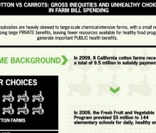
This week's graphic compares the money given in subsidies to eight cotton farms in California to that spent on the Fresh Fruit and Vegetable Program supplying snacks to elementary [...]
The Village Voice Web Award was given on December 7, 2011 to Liza De Guia for her series “Food Curated.” Hurricane Irene Aftermath: The Story of Maple Downs Farm was a [...]
Monday, Food+Tech Connect announced the winners of the Farm Bill Hackathon, but several other interesting projects were also created.[...]
Over the weekend the Farm Bill Hackathon brought together (in person and virtually) 120 designers, data scientists, developers, marketing professionals, food policy experts, and US[...]
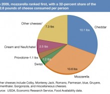
The average American in 2009 consumed almost an ounce and a half of cheese a day, according to the Food Availability (Per Capita) Data System of the Economic Research Service (ERS)[...]
Currently 90 volunteers in NYC, and another 40 virtually, will work on project ideas listed by leading experts.[...]
The National Research Council released a report today stating that "publicly posting enforcement and testing data...on the Internet could have substantial benefits, including the p[...]
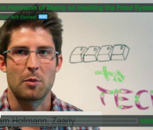
Adam Hofmann, Director of Marketing and Community Development at Zaarly, discusses creating a format to connect people throughout the food system.[...]
Knowing where food comes from and how it was grown is a top priority in an increasing number of American households. But aside from costly technological solutions employed by larg[...]
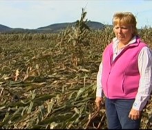
The weather has not been kind to farmers this year. Extreme Thanksgiving, designed by Resource Media, visualizes how your Thanksgiving dinner may have been affected by the element[...]
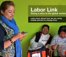
Increasingly consumers want to know where their food comes from and who grew it. But tracking parts of the system like wage rates and working conditions is difficult when business[...]
On December 3, 2011 hackathon participants will work together to produce tools or graphics that news media and organizations can use to convey the complexities and relevance of the[...]
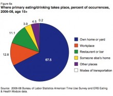
This week’s Infographic of the Week is a collection of data essential for those interested in the restaurant, shopping and meal preparation habits of those in the U.S.[...]
Food+Tech Connect has created a simple time line (with lots of links) below to illustrate the State of the Farm Bill, and to explain that, in the end, the outcome of all this Congr[...]
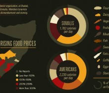
No less than nine visualizations have hit the virtual airwaves in the past few months looking at the crisis in the Horn of Africa, each taking a slightly different approach to hung[...]
The UN's World Food Programme is now employing new web-based gaming techniques aimed at involving and educating those concerned with world hunger.[...]
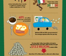
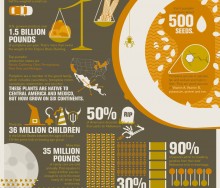
Well, it’s not Friday (Food+Tech Connect’s Infographic of the Week Day) but who can resist an infographic on coffee? [...]
This week’s pick goes to the good people at GOOD, whose “transparency department” produced an infographic looking at food insecurity in the U.S. This infographic [...]
Thus far, there is little in the way of visually interesting and informative media about the Farm Bill. But here are Food+Tech Connect's picks for the first 6 Farm Bill Media Sensa[...]
Yesterday, Food+Tech Connect announced we will be holding a “Farm Bill Hackathon” on December 3rd. But what is the “Farm Bill?”[...]
The History Channel created an elegant infographic about Halloween (yes, elegant – look at the colors!) detailing everything from the number of children who trick or treat, t[...]
18 Feb 2025
, 0 Comment
17 Dec 2024
, 0 Comment
Copyright © 2015
Food+Tech Connect. All Rights Reserved. Made in New York.

