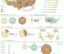
On December 3, 2011 hackathon participants will work together to produce tools or graphics that news media and organizations can use to convey the complexities and relevance of the[...]
21 Nov 2011
Thus far, there is little in the way of visually interesting and informative media about the Farm Bill. But here are Food+Tech Connect's picks for the first 6 Farm Bill Media Sensa[...]
03 Nov 2011
Yesterday, Food+Tech Connect announced we will be holding a “Farm Bill Hackathon” on December 3rd. But what is the “Farm Bill?”[...]
01 Nov 2011
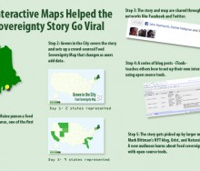
This year we witnessed first hand the power of open source tools to quickly spread the word about food system policy and planning. When Sedgwick, Maine passed the first food sover[...]
26 Sep 2011
It takes millions and millions of tons of food to feed a city. Somehow, enough milk and produce and soda makes its way to, say, Los Angeles; somehow it all gets distributed — frequ[...]
26 Sep 2011
Content is king when trying to attract readers and keep them coming back to your site. How do you sustain an audience? Several well-known writers opened up about strategies for kee[...]
15 Jun 2011
GOOD Food Editor Nicola Twilley launched GOOD magazine's new Food hub this past January. Through her editorial direction at GOOD, her blog Edible Geography, The Foodprint Project, [...]
24 Mar 2011
If you enjoy this website, I would appreciate if you could take a moment to register and vote for Food+Tech Connect in the WE Media 2011 Pitch It! Challenge. Your vote could help m[...]
09 Feb 2011
User interface and data visualization design firm FFunction created this infographic to visualize the severe decline of the honey bee population (Colongy Collapse Disorder) over th[...]
12 Jan 2011
Mint.com Mint.com created this interactive infographic visualizing the consumption, production, and production value of the most commonly used burrito ingredients.[...]
05 Jan 2011
“You’re about to die, what’s your last meal?” Since 2007, Studiofeast supper club founder Mike Lee has asked his mailing list subscribers to answer this que[...]
27 Dec 2010
Are you still not receiving food+tech bites in your inbox? Sign up here to ensure you get deliciously interesting food+tech news, tips, and the latest apps delivered right to your [...]
29 Nov 2010
Yesterday, the Food Safety Modernization Act (S. 510) debate began in the Senate. The contentious S. 510 legislation will significantly expand the FDA’s regulatory authority [...]
19 Nov 2010
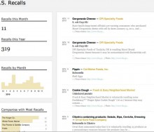
Flowing Data founder Nathan Yau has created an interactive infographic that allows you to explore FDA product recall and market withdrawals data. The graphic allows you to easily i[...]
13 Nov 2010
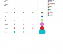
The use of Twitter, Foursquare, and Facebook in 2010 mid-term elections helped to reach and engage a wide range of individuals who might not have voted otherwise. This serves as a [...]
04 Nov 2010
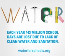
Last week was Blog Action Day, a day where 4,319 Blogs and 33.2 million readers from 131 different countries came together virtually to highlight and read about clean water. In all[...]
18 Oct 2010
Are you a visual thinker? I am and I dig data. I know for most its not a very exciting topic. In fact, eyes tend to glass over as soon as I utter the “d word.” But, I&#[...]
06 Oct 2010
As a new blogger, I never anticipated that our Visualizing our Food System post would spread so virally. It was incredible to see the response it provoked from people across a ran[...]
12 Aug 2010
12 Nov 2024
, 0 Comment
Copyright © 2015
Food+Tech Connect. All Rights Reserved. Made in New York.

