This Infographic details how US farmer mobile adoption for farm and business management is skyrocketing. [...]
19 Jul 2013
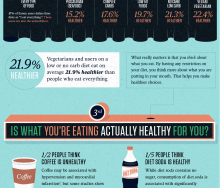
A look at Food+Tech Connect's top 5 food and health infographics of 2012.[...]
28 Dec 2012
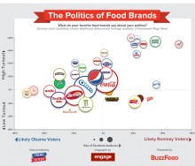
Two infographics look at Facebook data to understand how our daily food choices reflect our politics.[...]
05 Nov 2012
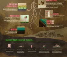
Wait, now rice is bad for you, too? Eating rice once a day can increase arsenic levels in the body by up to 44 percent , according to new research from Consumer Reports. Consumer R[...]
05 Oct 2012
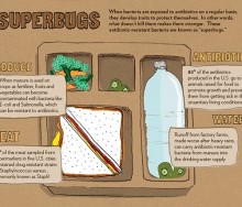
Applegate Farms has put together this handy infographic to give "supermoms" the "superpowers" to keep "superbugs" out of their kids' diets.[...]
28 Sep 2012
A collection of delicious infographics produced in the 'Open Data Cooking Workshop.'[...]
21 Sep 2012
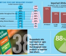
Supermarket News has put together some helpful infographics outlining key datapoints from recently published consumer insight reports on nutrition driven shopping behaviors and how[...]
14 Sep 2012
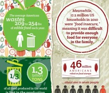
Three infographics break down and visualize staggering food waste data, how it relates to hunger and what consumers can do to reduce their waste. [...]
24 Aug 2012
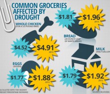
Consumers will likely be facing increased food prices of 4 to 5 percent in 2013 – as opposed to the average inflation of 2.5 to 3.5 percent – according to Consum[...]
31 Jul 2012
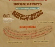
Applegate Farms breaks down how Americans feel about what is in their hot dogs and what they put on them.[...]
20 Jul 2012
FixFood's Meat Without Drugs campaign breaks down how "superbugs" travel from the farm to you.
[...]
29 Jun 2012
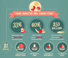
Americans may be spending less money on food, but dollars saved are just being spent on the resulting costs of poor health that plague the nation.
[...]
17 Jun 2012
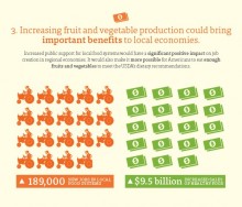
USDA dietary guidelines recommend that 50 percent of our daily food intake should be fruits and vegetables. But there is clearly a disconnect between the guidelines and the mere 2[...]
25 May 2012
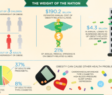
A new report released Monday, “Accelerating Progress in Obesity Prevention: Solving the Weight of the Nation,” by the Institute of Medicine (IOM), the health group of the National[...]
11 May 2012
Organic Trade Association forecasts for 2012 and 2013 indicate that organic food and non-food sales will continue to grow nine percent or higher annually.[...]
07 May 2012
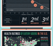
Massive Health visualizes their key findings about when, where, what and who people eat with.[...]
19 Apr 2012
Over the past 5 months, Massive Health has collected over 7.68 million food ratings from people in 50 countries. Today, they are releasing some of their key findings as a series of[...]
19 Apr 2012
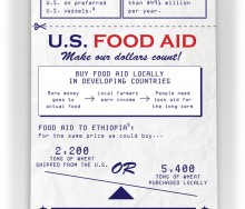
What is the human impact of inefficiencies in how your tax dollars are spent? In 2010 the U.S. spent $2 billion total on international food aid, but $491 million of those ta[...]
13 Apr 2012
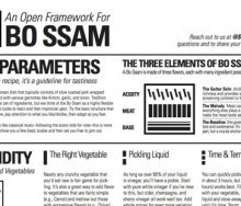
Studiofeast explores new approaches to cooking based on dish structure, rather than traditional recipe format. They believe this will result in a much more fulfilling experience in[...]
06 Apr 2012
Red Meat Is Killing You visualizes what "pink slime' is and how it's made.[...]
30 Mar 2012
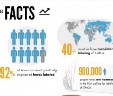
Just Label It, a campaign advocating for the labeling of genetically engineered (GE) foods, created the following infographic to illustrate why GE foods should be labeled.[...]
23 Mar 2012
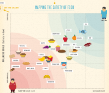
The latest infographic from Column Five and Massive Health maps the Satiety Index against the Inverted Glycemic Index to determine which foods fill you up and keep you satisfied.
[...]
16 Mar 2012
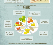
This week's infographic is an interesting visual timeline of USDA Food Guidelines, including commentary about the problems associated with each version of the guideline.[...]
02 Mar 2012
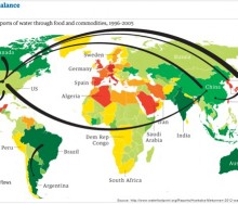
A new report on the "water footprint of humanity" from scientists at the University of Twente analyzes and maps global water use from 1996 to 2005. According to the study, agricu[...]
24 Feb 2012
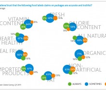
This week's infographic is a series of charts and graphs with fascinating information culled from an online survey by Nielsen of more than 25,000 people from 56 countries. [...]
17 Feb 2012
12 Nov 2024
, 0 Comment
Copyright © 2015
Food+Tech Connect. All Rights Reserved. Made in New York.


