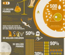
Americans will purchase 5 percent of the year's chocolate this week for Valentine's Day. But where does that chocolate come from and how is it grown, picked, processed and shipped[...]
10 Feb 2012
Today's infographic follows on the heels of last week's amazingly popular Carbs are Killing You visual and the lively conversation, and wish list for health and nutrition apps, tha[...]
03 Feb 2012
Last Friday, Food+Tech Connect posted “Carbs are Killing You” as the Infographic of the Week, and we received almost 70 comments on the visual. The responses are interesting and ex[...]
02 Feb 2012
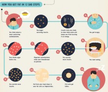
After all those years of not eating red meat and cutting back on the mayonnaise, science now tells us it's carbs, not fat, making Americans overweight. This interesting infographi[...]
26 Jan 2012
Public protest of the government's attempt to restrict information on the internet through SOPA / PIPA has postponed the debate for the time being. But the question of open and fr[...]
20 Jan 2012
Looking for programs in the farm bill related to public health, international development or commodity support? The Visualizer is an invaluable tool that allows viewers to interac[...]
13 Jan 2012
The U.S. Agency for International Development is celebrating 50 years as an organization. And after so many years of focusing on agriculture, the organization clearly has much know[...]
10 Jan 2012
This week’s Infographic of the Week was created by G+, and explains in detail the tech trends of the past year. But what Top Tech Trends of 2011 doesn’t tell you is th[...]
06 Jan 2012
“You’re about to die, what’s your last meal?” Anyone who signs up for Studiofeast's mailing list must answer this question. At the end of the year, the cooking collective then host[...]
05 Jan 2012
What could be more crowd pleasing than an infographic about coffee? How about an interactive visualization that allows coffee drinkers to chart their own caffeine use and preferen[...]
30 Dec 2011
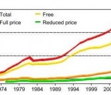
On the Friday before Christmas, Food+Tech Connect brings you a graphic from the USDA's Economic Reporting Service to help put things into perspective.[...]
23 Dec 2011
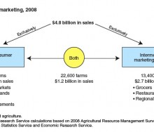
Local food seems to be all the rage - but how big is the trend and how is it working out for small scale farmers? [...]
16 Dec 2011
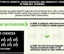
This week's graphic compares the money given in subsidies to eight cotton farms in California to that spent on the Fresh Fruit and Vegetable Program supplying snacks to elementary [...]
09 Dec 2011
Monday, Food+Tech Connect announced the winners of the Farm Bill Hackathon, but several other interesting projects were also created.[...]
07 Dec 2011
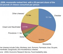
The average American in 2009 consumed almost an ounce and a half of cheese a day, according to the Food Availability (Per Capita) Data System of the Economic Research Service (ERS)[...]
02 Dec 2011
The weather has not been kind to farmers this year. Extreme Thanksgiving, designed by Resource Media, visualizes how your Thanksgiving dinner may have been affected by the element[...]
24 Nov 2011
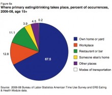
This week’s Infographic of the Week is a collection of data essential for those interested in the restaurant, shopping and meal preparation habits of those in the U.S.[...]
18 Nov 2011
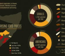
No less than nine visualizations have hit the virtual airwaves in the past few months looking at the crisis in the Horn of Africa, each taking a slightly different approach to hung[...]
11 Nov 2011
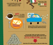
Well, it’s not Friday (Food+Tech Connect’s Infographic of the Week Day) but who can resist an infographic on coffee? [...]
07 Nov 2011
This week’s pick goes to the good people at GOOD, whose “transparency department” produced an infographic looking at food insecurity in the U.S. This infographic [...]
04 Nov 2011
The History Channel created an elegant infographic about Halloween (yes, elegant – look at the colors!) detailing everything from the number of children who trick or treat, t[...]
28 Oct 2011
The Public Health Program created an infographic to look at "The Two Sides of the Food Crisis," and to untangle the many factors causing the crisis.[...]
21 Oct 2011
In recognition of National School Lunch Week held this week from October 10-14, 2011, the University of Southern California’s Masters of Arts in Teaching Program has develope[...]
11 Oct 2011
Last week, Environmental Working Group released Meat Eater’s Guide to Climate Change+Health, to make it easier for consumers to green their diet and the planet. They partnere[...]
24 Jul 2011
Farming First, a multi-stakeholder coalition whose goal is to further sustainable agriculture development worldwide, has launched a six-part online infographic called “The St[...]
23 May 2011
12 Nov 2024
, 0 Comment
Copyright © 2015
Food+Tech Connect. All Rights Reserved. Made in New York.


