News + Analysis
Browse by topic
Tags
agriculture
agtech
amazon
apps
Biodiversity
Blue Apron
cpg
cultivated meat
cultured meat
data
food
food+tech
food data
Food Delivery
food entrepreneurs
food innovation
food startup
food startups
food system
food tech
foodtech
food technology
food waste
future of dining
future of food
Hack//Dining
Hack//Dining NYC
health
infographic
Internet of Food
local food
Mobile
nutrition
plant-based
plant-based meat
recipes
restaurant tech
Social Media
startup
sustainable food
technology
Tools
USDA
video
Whole Foods
Food+Tech Connect has created a simple time line (with lots of links) below to illustrate the State of the Farm Bill, and to explain that, in the end, the outcome of all this Congr[...]
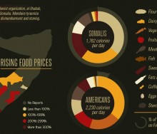
No less than nine visualizations have hit the virtual airwaves in the past few months looking at the crisis in the Horn of Africa, each taking a slightly different approach to hung[...]
The UN's World Food Programme is now employing new web-based gaming techniques aimed at involving and educating those concerned with world hunger.[...]
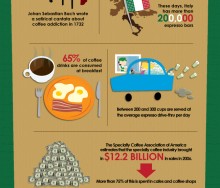
Well, it’s not Friday (Food+Tech Connect’s Infographic of the Week Day) but who can resist an infographic on coffee? [...]
Grocery list and recipe search startup Ziplist uses a cadre of advanced technologies to make shopping and marketing easier and personalized, including natural language processing, [...]
This week’s pick goes to the good people at GOOD, whose “transparency department” produced an infographic looking at food insecurity in the U.S. This infographic [...]
For a community that has been plagued by heat, flooding, or tornadoes - climate change has no longer become a fad or some theory concocted by a team of scientists in a laboratory i[...]
The History Channel created an elegant infographic about Halloween (yes, elegant – look at the colors!) detailing everything from the number of children who trick or treat, t[...]
While hacking and re-imagining the food system here in the U.S., can we interact with, learn from and collaborate with like-minds on a global scale to meet the needs of growing pop[...]
BROWSE BY TOPIC
agriculture
agtech
amazon
apps
Biodiversity
Blue Apron
cpg
cultivated meat
cultured meat
data
food
food+tech
food data
Food Delivery
food entrepreneurs
food innovation
food startup
food startups
food system
food tech
foodtech
food technology
food waste
future of dining
future of food
Hack//Dining
Hack//Dining NYC
health
infographic
Internet of Food
local food
Mobile
nutrition
plant-based
plant-based meat
recipes
restaurant tech
Social Media
startup
sustainable food
technology
Tools
USDA
video
Whole Foods
Events
09:30 am
09:30 am
09:30 am
09:30 am
09:30 am
09:30 am
09:30 am
09:30 am
09:30 am
09:30 am
09:30 am
09:30 am
09:30 am
09:30 am
09:30 am
09:30 am
09:30 am
09:30 am
09:30 am
09:30 am
09:30 am
09:30 am
09:30 am
09:30 am
09:30 am
09:30 am
09:30 am
09:30 am
09:30 am
09:30 am
09:30 am
09:30 am
09:30 am
09:30 am
09:30 am
09:30 am
09:30 am
09:30 am
09:30 am
09:30 am
09:30 am
09:30 am
09:30 am
09:30 am
09:30 am
09:30 am
09:30 am
09:30 am
09:30 am
09:30 am
09:30 am
09:30 am
09:30 am
09:30 am
09:30 am
09:30 am
09:30 am
09:30 am
09:30 am
09:30 am
09:30 am
09:30 am
09:30 am
09:30 am
09:30 am
09:30 am
09:30 am
09:30 am
09:30 am
09:30 am
09:30 am
09:30 am
09:30 am
09:30 am
Copyright © 2015
Food+Tech Connect. All Rights Reserved. Made in New York.

