EATERS
This post outlines the rough prototype of a dinner planning app built r to customize, scale, and shop for a menu, then organize all of the required steps into one master to-do lis[...]
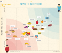
The latest infographic from Column Five and Massive Health maps the Satiety Index against the Inverted Glycemic Index to determine which foods fill you up and keep you satisfied.
[...]
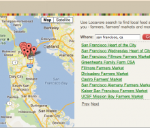
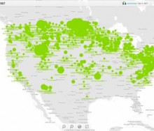
Local Dirt and Locavore recently launched a free search widget and API for their farm, farmers market and CSA mapping data. There are over 35,000 United States and Canad-based farm[...]
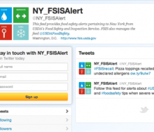
There are two interesting pieces of news from last week on the ways social media is being leveraged to share information about food safety concerns, as well as to predict outbreaks[...]
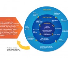
This June 5, the best and brightest of the food tech community are being invited to showcase your work at the third annual Health Data Palooza. Hosted by The Health Health Data In[...]
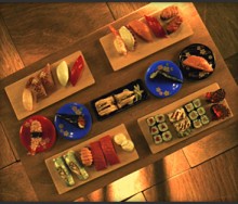
“The Story of Sushi” is an enlightening tale of sushi's journey from sea-to-plate. Created as a marketing video for Bamboo Sushi, a sustainable sushi restaurant in Portland, Oregon[...]
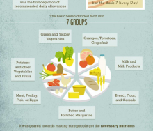
This week's infographic is an interesting visual timeline of USDA Food Guidelines, including commentary about the problems associated with each version of the guideline.[...]
In this video from TEDxManhattan, James Beard Foundation Executive Vice President Mitchell Davis talks about taste as a powerful tool for social change. [...]
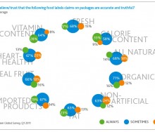
This week's infographic is a series of charts and graphs with fascinating information culled from an online survey by Nielsen of more than 25,000 people from 56 countries. [...]
Two interesting surveys about technology use in restaurants predict trends for 2012. But the specifics of those trends seem to be lacking, and to find out more, Food+Tech Connect [...]
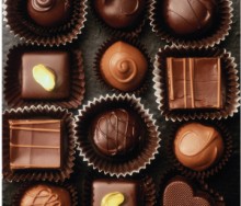
Americans will purchase 5 percent of the year's chocolate this week for Valentine's Day. But where does that chocolate come from and how is it grown, picked, processed and shipped[...]
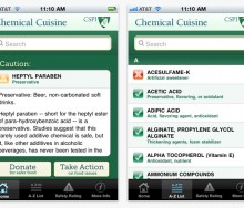
McDonalds recently announced it will no longer include “pink slime” (ammonium hydroxide) in its burgers. But what about all the other chemical additives we’ve never heard of and ca[...]
Today's infographic follows on the heels of last week's amazingly popular Carbs are Killing You visual and the lively conversation, and wish list for health and nutrition apps, tha[...]
Last Friday, Food+Tech Connect posted “Carbs are Killing You” as the Infographic of the Week, and we received almost 70 comments on the visual. The responses are interesting and ex[...]
Processed food like ramen noodles and gummy bears are bad for you. Now, for the first time ever, you can see how for yourself.
Artist and provacateur Stefani Bardin's newest pro[...]
One of eight SXSW's Interactive Accelerator Finalists in the Innovative Web Technologies category announced today, AgLocal aims to use technology to empower carnivores to buy meat [...]
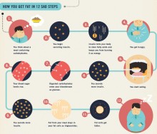
After all those years of not eating red meat and cutting back on the mayonnaise, science now tells us it's carbs, not fat, making Americans overweight. This interesting infographi[...]
If you could plan your diet so that you got paid every time you chose a salad over a burger, would you chose the salad? would you chose the salad?
IBM “Master Inventor” Michael[...]
The tech industry has brought about many recent innovations in business, but perhaps one of the most important for those in food+tech is the trend toward monetizing knowledge. No l[...]
The advice awaited me in my inbox Monday morning. “Use fat-free or low-fat evaporated milk in place of cream in coffee and tea for a smooth taste, more calcium, and little or no fa[...]
"Knowing where your food comes from" is arguably today's biggest food trend. But to Source Map CEO Leonardo Bonanni PhD, traceability is far more than a fad. [...]
You have likely heard the paradox: 40 percent of food produced in the U.S. is thrown away (enough food trash to fill the Rose Bowl every day), yet it’s now estimated that one[...]
“You’re about to die, what’s your last meal?” Anyone who signs up for Studiofeast's mailing list must answer this question. At the end of the year, the cooking collective then host[...]
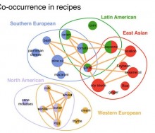
In 1992, chefs Heston Blumenthal and Francois Benzi came up with a “food pairing hypothesis.” Now an article in Scientific Reports disputes the foodpairing concept. [...]
What could be more crowd pleasing than an infographic about coffee? How about an interactive visualization that allows coffee drinkers to chart their own caffeine use and preferen[...]
18 Feb 2025
, 0 Comment
17 Dec 2024
, 0 Comment
Copyright © 2015
Food+Tech Connect. All Rights Reserved. Made in New York.

