infographic
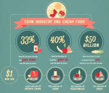
Americans may be spending less money on food, but dollars saved are just being spent on the resulting costs of poor health that plague the nation.
[...]
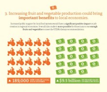
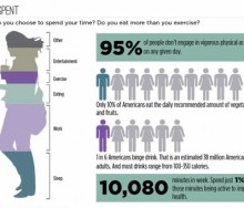
USDA dietary guidelines recommend that 50 percent of our daily food intake should be fruits and vegetables. But there is clearly a disconnect between the guidelines and the mere 2[...]
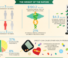
A new report released Monday, “Accelerating Progress in Obesity Prevention: Solving the Weight of the Nation,” by the Institute of Medicine (IOM), the health group of the National[...]
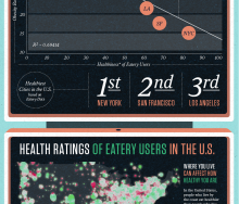
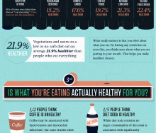
Massive Health visualizes their key findings about when, where, what and who people eat with.[...]
Over the past 5 months, Massive Health has collected over 7.68 million food ratings from people in 50 countries. Today, they are releasing some of their key findings as a series of[...]
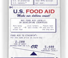
What is the human impact of inefficiencies in how your tax dollars are spent? In 2010 the U.S. spent $2 billion total on international food aid, but $491 million of those ta[...]
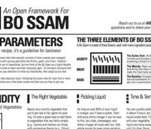
Studiofeast explores new approaches to cooking based on dish structure, rather than traditional recipe format. They believe this will result in a much more fulfilling experience in[...]
Red Meat Is Killing You visualizes what "pink slime' is and how it's made.[...]
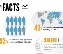
Just Label It, a campaign advocating for the labeling of genetically engineered (GE) foods, created the following infographic to illustrate why GE foods should be labeled.[...]
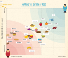
The latest infographic from Column Five and Massive Health maps the Satiety Index against the Inverted Glycemic Index to determine which foods fill you up and keep you satisfied.
[...]
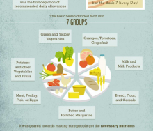
This week's infographic is an interesting visual timeline of USDA Food Guidelines, including commentary about the problems associated with each version of the guideline.[...]
Americans will purchase 5 percent of the year's chocolate this week for Valentine's Day. But where does that chocolate come from and how is it grown, picked, processed and shipped[...]
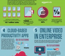
Today's infographic follows on the heels of last week's amazingly popular Carbs are Killing You visual and the lively conversation, and wish list for health and nutrition apps, tha[...]
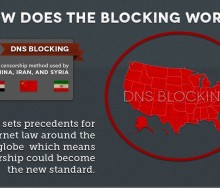
Public protest of the government's attempt to restrict information on the internet through SOPA / PIPA has postponed the debate for the time being. But the question of open and fr[...]
Looking for programs in the farm bill related to public health, international development or commodity support? The Visualizer is an invaluable tool that allows viewers to interac[...]
This week’s Infographic of the Week was created by G+, and explains in detail the tech trends of the past year. But what Top Tech Trends of 2011 doesn’t tell you is th[...]
“You’re about to die, what’s your last meal?” Anyone who signs up for Studiofeast's mailing list must answer this question. At the end of the year, the cooking collective then host[...]
What could be more crowd pleasing than an infographic about coffee? How about an interactive visualization that allows coffee drinkers to chart their own caffeine use and preferen[...]
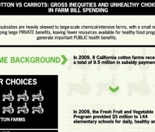
This week's graphic compares the money given in subsidies to eight cotton farms in California to that spent on the Fresh Fruit and Vegetable Program supplying snacks to elementary [...]
Monday, Food+Tech Connect announced the winners of the Farm Bill Hackathon, but several other interesting projects were also created.[...]
Over the weekend the Farm Bill Hackathon brought together (in person and virtually) 120 designers, data scientists, developers, marketing professionals, food policy experts, and US[...]
The weather has not been kind to farmers this year. Extreme Thanksgiving, designed by Resource Media, visualizes how your Thanksgiving dinner may have been affected by the element[...]
On December 3, Food+Tech Connect and Gojee are bringing together journalists, technologists, designers, policy makers, and food data specialists to develop tools and visualizations[...]
This week’s pick goes to the good people at GOOD, whose “transparency department” produced an infographic looking at food insecurity in the U.S. This infographic [...]
The Public Health Program created an infographic to look at "The Two Sides of the Food Crisis," and to untangle the many factors causing the crisis.[...]
18 Feb 2025
, 0 Comment
17 Dec 2024
, 0 Comment
Copyright © 2015
Food+Tech Connect. All Rights Reserved. Made in New York.

