data visualization
In the United States, nearly 15 percent of families are food insecure. The government recently cut $5 billion dollars in food stamp funding, and a recent report by the U.S. Confere[...]
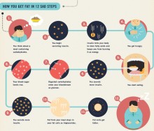
A look at Food+Tech Connect's top 5 food and health infographics of 2012.[...]
PBS's America Revealed released a short clip visualizing a New York City Domino pizza delivery route, which went viral thanks to some influential blogs. The spread of the video off[...]
What can tweets tell us about global food consumption and its impact on emotional well-being? FoodMood is an interactive data visualization project that aims to measure global food[...]
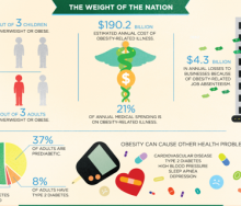
A new report released Monday, “Accelerating Progress in Obesity Prevention: Solving the Weight of the Nation,” by the Institute of Medicine (IOM), the health group of the National[...]
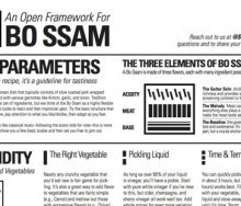
Studiofeast explores new approaches to cooking based on dish structure, rather than traditional recipe format. They believe this will result in a much more fulfilling experience in[...]
The Food and Agriculture Organization of the United Nations (FAO) has recently released a new resource that will make its agricultural development strategy a whole lot easier. The [...]
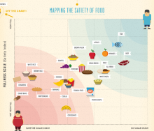
The latest infographic from Column Five and Massive Health maps the Satiety Index against the Inverted Glycemic Index to determine which foods fill you up and keep you satisfied.
[...]
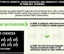
This week's graphic compares the money given in subsidies to eight cotton farms in California to that spent on the Fresh Fruit and Vegetable Program supplying snacks to elementary [...]
Monday, Food+Tech Connect announced the winners of the Farm Bill Hackathon, but several other interesting projects were also created.[...]
On December 3, Food+Tech Connect and Gojee are bringing together journalists, technologists, designers, policy makers, and food data specialists to develop tools and visualizations[...]
Yesterday, Food+Tech Connect announced we will be holding a “Farm Bill Hackathon” on December 3rd. But what is the “Farm Bill?”[...]
The Public Health Program created an infographic to look at "The Two Sides of the Food Crisis," and to untangle the many factors causing the crisis.[...]
Data visualists David McCandless and Willow Tyrer explore 1000 recipes from BBC Food and Epicurious to visualize flavor patterns. The series of “infoodgraphics,” as McC[...]
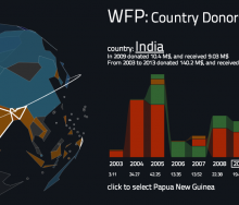
In early July I read in The New York Times that the World Bank is releasing 7,000 data sets into the public domain. So I decided to check it out and see what’s there. Not a lot, it[...]
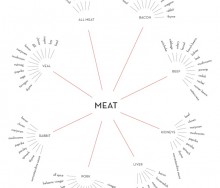
Last week, Environmental Working Group released Meat Eater’s Guide to Climate Change+Health, to make it easier for consumers to green their diet and the planet. They partnere[...]
I had the pleasure of participating in Emily Cavalier's TECHmunch panel- What’s New in Food: Understanding Trends to Enrich Your Content. The following is a round-up of some of the[...]
11 Jun 2011
UncategorizedHealth | Tech | Food Infographic ReelView more presentations from Luminary Labs. Last week, Luminary Labs hosted Health | Tech | Food, a Social Media Week event that brought togeth[...]
User interface and data visualization design firm FFunction created this infographic to visualize the severe decline of the honey bee population (Colongy Collapse Disorder) over th[...]
Up until a couple of weeks ago, the largest event I had ever organized were dinner parties for 10 in my apartment. Then the Food+Tech Hackathon came along. With 12 days of lead ti[...]
Mint.com Mint.com created this interactive infographic visualizing the consumption, production, and production value of the most commonly used burrito ingredients.[...]
“You’re about to die, what’s your last meal?” Since 2007, Studiofeast supper club founder Mike Lee has asked his mailing list subscribers to answer this que[...]
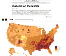
This interactive visualization by SlateLabs demonstrates the rise in diabetes diagnoses among adult Americans. Slate used data from the Centers for Disease Control and Prevention t[...]
As the founder of the internet venture, GourmetOrigins, one of the topics that often comes up when speaking with people in the food industry is technology and particularly, how to [...]
It’s been quite a week for food safety! Tuesday, the senate approved the largest overhaul of food safety legislation in 70 years. If passed, the Food Safety Modernization Act[...]
12
18 Feb 2025
, 0 Comment
17 Dec 2024
, 0 Comment
Copyright © 2015
Food+Tech Connect. All Rights Reserved. Made in New York.

