In the United States, nearly 15 percent of families are food insecure. The government recently cut $5 billion dollars in food stamp funding, and a recent report by the U.S. Conference of Mayors found that 83 percent of cities surveyed reported an increase in requests for emergency food assistance in 2013. Globally the picture is even more devastating; 842 million people are hungry, and 98 percent of those people live in developing countries, according to the Food and Agriculture Organization (FAO).
But what do global relief efforts look like? A new data visualization by data scientist and designer Santiago Ortiz brings light to the massive web of global hunger relief. Leveraging data from the U.N. World Food Programme (WFP), the globe-shaped, interactive visualization shows WFP’s efforts to feed the hungry from 2003-2013.
The visualization does not point to any trends or make specific observations about the data, instead it allows viewers to click on different countries to learn more about each nation’s relief track record. Taking a few minute spin around the visualization, I discovered some interesting data. A few of my findings are below. You can take your own self-guided tour here.
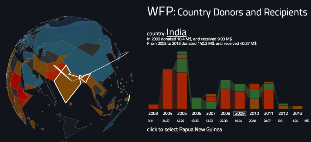
India – which has a hunger rate of 1 in 4 – for example, donated $140.2 million and received only $40.37 million over the ten year period. Japan and Australia were its major donors, while Yemen, Afghanistan and Syria were among the countries it gave to.
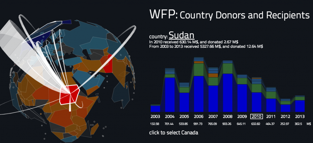
While in Africa, which is home to 227 million of the world’s hungry, Sudan received $5.3 billion over the past decade and donated $12.6 million. The majority of aid to Sudan has come from the United States every year for the past decade.
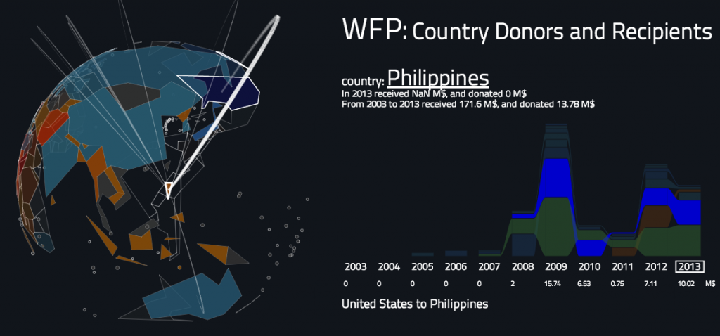
The visualization also offers an interesting glimpse at the politics of relief as well. For example, the Philippines only received $12.67 million in 2013 – the year it got hit by its most devastating typhoon to date – vs. $23.83 million in 2009.
Ortiz’s globe inspires users to think holistically about the massive web of hunger relief. “I expect that a curious user will find several different stories in this complex global story of cooperation,” he tells Co.Design.


