visualization
Last week, Environmental Working Group released Meat Eater’s Guide to Climate Change+Health, to make it easier for consumers to green their diet and the planet. They partnere[...]
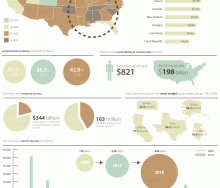
Online business directory eLocal USA created the following infographic to visualize the true environmental, social, and economic impacts of our purchases. (Click to enlarge) Source[...]
In this five part series, Bob Wall breaks down how created the interactive mapping system for the food sovereignty, urban agriculture zoning, and food policy council maps. In part [...]
What does—or could, or even should—it mean to write about food today? I am honored to join more than 40 amazing writers in a conversation about this question as part of a multi-sit[...]
User interface and data visualization design firm FFunction created this infographic to visualize the severe decline of the honey bee population (Colongy Collapse Disorder) over th[...]
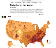
This interactive visualization by SlateLabs demonstrates the rise in diabetes diagnoses among adult Americans. Slate used data from the Centers for Disease Control and Prevention t[...]
I am thrilled to introduce Christine Rico, my business and idea weaving advisor. Christine and I have been working together to take all of my ideas and the amazing people and oppor[...]
Thank you so much to everyone who came out yesterday for the inaugural Food+Tech Hackathon! I will be covering all of the interesting people, projects, and outcomes from the event [...]
It’s been quite a week for food safety! Tuesday, the senate approved the largest overhaul of food safety legislation in 70 years. If passed, the Food Safety Modernization Act[...]
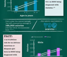
Infographic about the health and fiscal cost school lunches using USDA, Let's Move & Slow Food USA data.[...]
In 2010, the USDA National Farmers Market Directory counted over 6,200 operational farmers markets in the country. That’s more than a 16 percent growth in farmers markets from 2009[...]
Email not displaying correctly? View it in your browser. This weekly newsletter was started to help you keep up-to-date with interesting events, companies, and research that are ch[...]
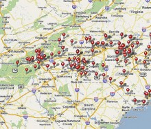
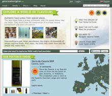
Miquel Ros had been an information manager at Bloomberg when he started on a ‘side project’ to create an interactive map of his favorite cheeses, their origins, and the[...]
I’ve started a weekly newsletter to help you keep up-to-date about interesting events, companies, and research that are changing the way we produce, distribute, and consume f[...]
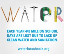
Last week was Blog Action Day, a day where 4,319 Blogs and 33.2 million readers from 131 different countries came together virtually to highlight and read about clean water. In all[...]
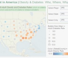
Rina Peterson's "Fit & Fat in America" enable users to examine various factors associated with obesity.[...]
Are you a visual thinker? I am and I dig data. I know for most its not a very exciting topic. In fact, eyes tend to glass over as soon as I utter the “d word.” But, I&#[...]
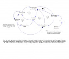
We know that systems are complex and interconnected. I write a lot about the ways in which data, networks, information technology and the web relate to the food system and to each [...]
It was exciting to see such an overwhelming response to the food system visualization we posted last week. The map served to start defining the food+tech space and identifying the[...]
18 Feb 2025
, 0 Comment
17 Dec 2024
, 0 Comment
Copyright © 2015
Food+Tech Connect. All Rights Reserved. Made in New York.

