“We believe that change is needed in the way we consume and produce food. We don’t pretend to have the answer to what that change should be. It’s complicated. How[...]
10 Mar 2011
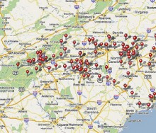
Waiting for your street to be plowed? In need of a shovel or snow blower? Car stuck in the snow? Abandoned your car in the middle of the street? Subway platform snowed in? You coul[...]
27 Dec 2010
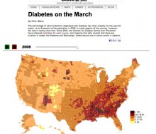
This interactive visualization by SlateLabs demonstrates the rise in diabetes diagnoses among adult Americans. Slate used data from the Centers for Disease Control and Prevention t[...]
19 Dec 2010
It was 8:00 a.m. on a Saturday morning in Soho, the streets lay quiet and Broadway was not yet filled with shopping tourists. Though one floor above, at co-working space Soho Haven[...]
07 Dec 2010
It’s been a while since I’ve worked on this site, but thanks to the Food+Tech Hackathon I’ve taken the time to really think about how the data and tools I’m building should evolve.[...]
06 Dec 2010
In 2010, the USDA National Farmers Market Directory counted over 6,200 operational farmers markets in the country. That’s more than a 16 percent growth in farmers markets from 2009[...]
17 Nov 2010
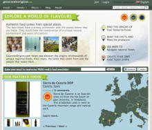
Miquel Ros had been an information manager at Bloomberg when he started on a ‘side project’ to create an interactive map of his favorite cheeses, their origins, and the[...]
12 Nov 2010
The use of Twitter, Foursquare, and Facebook in 2010 mid-term elections helped to reach and engage a wide range of individuals who might not have voted otherwise. This serves as a [...]
04 Nov 2010
The first two days of the UN Digital Media Lounge (DML) provided great insight into how the world’s leading development organizations are leveraging technology to improve the[...]
23 Sep 2010
It was exciting to see such an overwhelming response to the food system visualization we posted last week. The map served to start defining the food+tech space and identifying the[...]
29 Jul 2010
The farmer usually knows best – for his or her land, crop, livestock, and profitability, among other things. As a girl on a Minnesota farm in the ‘80s and ‘90s, I was in awe of my [...]
16 Jul 2010
12 Nov 2024
, 0 Comment
Copyright © 2015
Food+Tech Connect. All Rights Reserved. Made in New York.


