If you follow Food+Tech Connect, you know that we love data, food and infographics, which is why we were particularly excited to stumble upon these delicious infographics produced in the ‘Open Data Cooking Workshop.’ Hosted by Helsinki-based Data Cuisine, the workshop aimed to use food to visualize local data.
Earlier this year, co-organizer Susanne Jaschko began thinking about how the characteristics of food, such as color, form, texture, temperature, smell, taste, culture and origin offer an abundance of 2D and 3D “culinary variables” that can be used to express information. “What if a fish soups taste is based on publicly available local fishing data?” write the founders of Data Cusine, “Or what a pizza would be like if it was based on Helsinki’s population mix?”
And so, the workshop was born, asking participants to express data through experienceable food. The workshop concluded with, what looks like, a delicious open data feast. Take a look at the dishes that emerged from the event, which are available here, to see if you agree with Jaschko.
The following are a small selection of the dishes produced during the workshop:
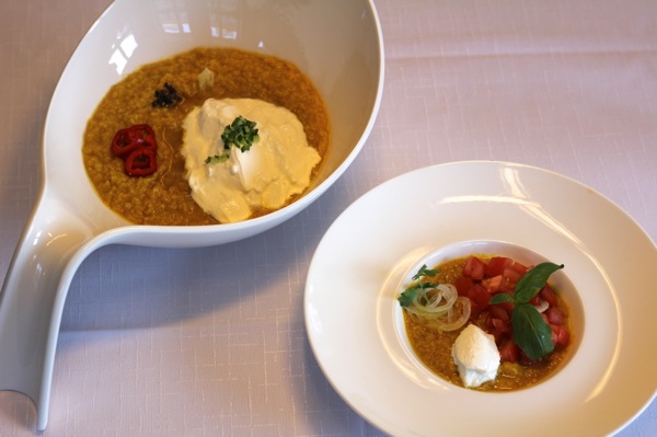
“Age & Language in Lentils,” by Matt Zumwalt, portrays the languages spoken in the U.S. and Italy, by median age and population size. For example, the number of lentils represents each country’s total population. The yogurt represents the English speaking population, while the tomatoes and basil symbolize the Italian speaking population.
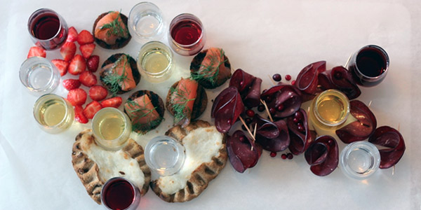
Kippis! uses the typical foods of Finland’s regions to create a map of the country. The amount of alcohol in each glass demonstrates differences in alcohol consumption across the country.

