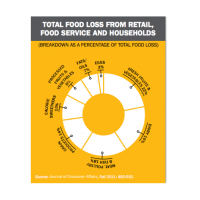
Earlier today I reported on the new Natural Resources Defense Council report examining the areas of the U.S. food supply chain generating the most waste and opportunities for reducing such waste.
The following infographics further break down and visualize variations of staggering food waste data. Which do you think is most effective?
The first infographic from Face the Facts USA demonstrates the relationship between waste and hunger.
The second infographic from Door To Door Organics explains why food waste is a problem and offers tips for what consumers can do to reduce waste.
The final infographic from Next Generation Food illustrates food waste’s impact on climate change resulting from excess freshwater and fossil fuel consumption, as well as methane and CO2 emissions from food decomposing in the landfill.


