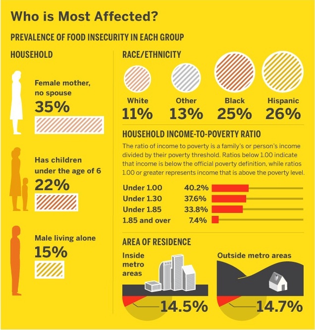
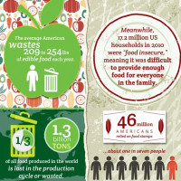
This week’s pick goes to the good people at GOOD, whose “transparency department” produced an infographic looking at food insecurity in the U.S.
This infographic is a great example of how to take dry and boring statistics (US Census and USDA data) and turn them into an understandable and interesting visual. While the color scheme is a bit overwhelming, it does help to convey the urgency of the matter, and allows viewers to easily see how the problem is growing.
New data since the creation of this chart shows now that SNAP (food stamp) use is up 8.1% from 2010 – equaling around 20% of the population in many southern states. Food prices are also still rising. SNAP is supported by money from the Farm Bill, and could face severe cuts in the 2012 version.
Below is an excerpt of the larger graphic. To view the entire page, click here.


