 In the United States 35 percent of adults and 17 percent of children are obese. Medical costs related to obesity reached 147 billion in 2008 alone. And obesity-related conditions including heart disease and type 2 diabetes are among the leading causes of preventable death. The situation is so severe that the American Medical Association recently declared obesity a disease.
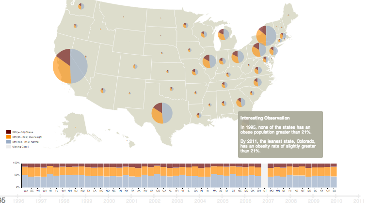
A new infographic by Lih Chen visualizes how obesity rates have skyrocketed over the past two decades. Utilizing data from the CDC and the United States Census Bureau, Chen’s interactive infographic graphs the obese, overweight and normal weight populations of every state from 1995 to 2011. Visit Chen’s website to see how the population’s collective BMI changes over the 16-year period.
The infographic highlights one distressing observation: in 1995 none of the states had an obesity rate above 21%, while in 2011 the “leanest” state, Colorado, had a rate just over 21 percent. The statistics elsewhere are equally upsetting. For example, in New York in 1995, the obese, overweight and normal populations were 2.5, 6.5 and 9 million respectively. By 2011 the rate of obesity had doubled, 6.9 million were overweight and the normal weight population decreased to 7.3 million.
Though Chen’s visualization paints a bleak picture of the obesity epidemic, recent statistics show decreased rates of childhood obesity in many cities and decreased soda consumption on the whole. Stressing exercise and nutritious food, initiatives such as Let’s Move and Food Revolution and organizations like Wholesome Wave and FoodCorps are working to raise a healthier generation of children.


