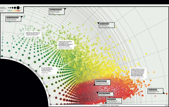
In an attempt to scrape massive datasets and “produce something wonderful,” Wired crawled and visualized the Food Network’s database of 49,733 recipes to shed light on how and what America eats. With data-miner, Dylan Fried, at the helm, the team crawled the recipes and 906,539 ratings, and then put them into Mongo, a non-relational database, which allowed them to input all kinds of questions and parameters. Using this data, Josef Reyes and Catalogtree, created 26 infographics, which illustrate things like the total cost of saffron used in the site’s recipes and three growing ingredient trends.
Perhaps the most fascinating, the visualization below aggregates the ratings, number of reviews and number of ingredients from every recipe in the database. Red indicates the highest rated recipes, a larger circle means more ingredients, and circles farther from the black center have more reviews.
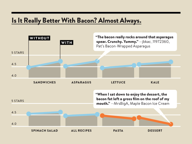
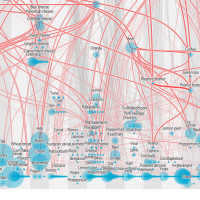
“Is It Really Better with Bacon. Almost Always” illustrates how many ingredients, including asparagus and kale, receive higher ratings when combined with bacon, while only pasta (surprising) and dessert see decreased ratings.
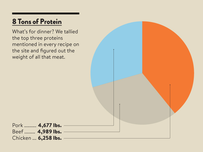
“8 Tons of Protein”- illustrates the total amount of meat that the top three recipe proteins- chicken, pork, and beef- would actually yield.
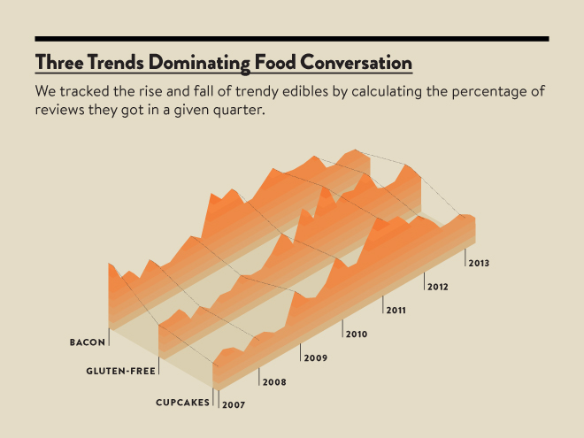
In terms of food trends, the data found that bacon reviews peaked in 2010, gluten-free spiked at the beginning of 2012 and 2013 (new years resolutions, anyone?), and cupcakes had their hay day at the start of 2012, and have steadily declined since.
There are plenty more food trends to discover – check out all 26 infographics here.

![[Infographic] Growing the Home Food Gardening Movement](https://foodtechconnect.com/wp-content/uploads/2014/08/Screen-shot-2014-08-08-at-11.57.40-AM-200x200.png)

