What can tweets tell us about global food consumption and its impact on emotional well-being?
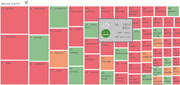
A lot when combined with country Gross Domestic Product data from CIA World Factbook and obesity level data from World Heath Organization, finds Affect Lab, Ai Applied, and Jana + Koos. The groups recently created FoodMood, an interactive data visualization project that aims to measure global food sentiment. FoodMood applies natural language processing techniques to geo-located tweets about what people are eating and how they feel about their food, and then overlays them with the GDP and obesity data. Users can look at trends within an individual country or compare countries, and can filter by the data by popularity, time, number of tweets.
Block sizes is the visualization above correspond to the number of tweets about that particular food. The various treemap colors represents a range of sentiments from “least happy” to “most happy.”
The Goal?
According to the website:
“As a sentiment analysis tool, FoodMood develops a more informed global picture about food and emotion. As a data visualization project, FoodMood shows the connections, patterns and relationships that exist between the variables — insights that are otherwise practically infeasible. Ultimately, FoodMood helps reveal a hidden layer of digital and social data that pushes the boundaries of awareness and understanding of our surroundings one step further.”
The group’s academic paper, published by the Association for the Advancement of Artificial Intelligence, offers further insight into their goals:
“Food consumption – a naturally social phenomenon –and its reflection in the emotional social web of Twitter becomes a lens to reveal patterns in society. One of the questions FoodMood addresses the growing problem of obesity globally can be reflected with the use this tool. Specifically can these obesity-contributing foods be categorized and quantified? With the affordance of information visualisation tools, that help amplify cognition, researchers and users can gain a better understanding of millions of processes and events as well as uncover patterns that were “hidden” in mountains of facts, numbers, words and percentages. Beyond helping discover new understandings amidst a profoundly complicated world where too much data creates a problem of scaling, a great visualization can help create a shared view of a situation and align people on needed action.
Findings
Currently, FoodMood only uses English-language Tweets, so the tool does not offer much by way of international analysis but the website indicates they will be working on this in the future. Still, the project offers some interesting insights:
- Meat consumption is high all over the world and has very positive sentiment ratings of 70 percent and over.
- In most countries, fast-food companies, like McDonald’s, Burger King, KFC and Chipotle, dominate online food consumption conversation, but related sentiment ratings vary across countries.
- 58 percent of the 50 most tweeted about foods globally have high glycemic index, fat, and sugar content, which are all correlated with contributing to obesity.
- According to the sentiment analysis of the world’s poorest countries, there is no correlation between wealth and happiness when it comes to food.
More detailed information about the project and their findings are included in the academic paper.


