Yesterday, as part of the Healthy Food, Healthy Farms Webinar Series, Food+Tech Connect presented the work completed at the Farm Bill Hackathon. But perhaps more impressive was the presentation made by Roni Neff of the Johns Hopkins Center for a Livable Future (CLF) about the Farm Bill Budget Visualizer.
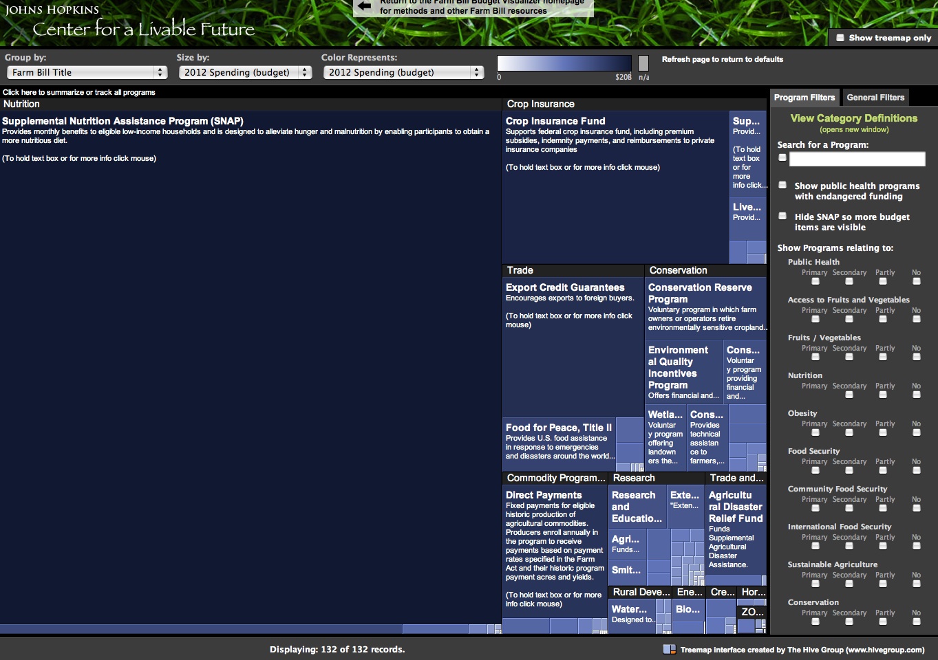
The Visualizer is an invaluable tool,created by CLF and inspired by Marjorie Roswell,that allows viewers to interact with the farm bill budget in ways not before possible. Want to know how much money goes into organic crop research? Scroll over and see the budget, its relation to other research investments, and how it has changed over time.
Looking for programs in the farm bill related to public health, international development or commodity support? You can filter out for that too. And perhaps most importantly, the visualizer gives the public the opportunity to visualize the size of their investments in relation to each other. You can even take out the SNAP budget (“Food Stamps” and by far the largest area of funding in the bill) to better see the nitty gritty of the overall budget.
The version below is a static version of the basic homepage of the Visualizer. Please go to the Farm Bill Budget Visualizer page to interact with the graphic.


![[Infographic of the Week] How to Create 189k Jobs & Increase Healthy Food Sales by $9.5B](https://foodtechconnect.com/wp-content/uploads/2012/05/plant-the-plate-infographic-full1-200x200.jpg)


