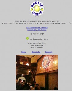
Trying to navigate a restaurant’s website from my cellphone is often an annoying and time-consuming experience.
Why? Many restaurant websites are decked out with all the old Flash glitz and cannot be opened by the smartphones of today.
Which is why startups such as When I’m Mobile & ChompStack have developed tools to easily develop mobile based websites. When I’m Mobile is the brainchild of New Yorker Jonathan Thaler. I was immediately excited when I learned that Thaler’s first restaurant client is personal favorite of mine, Paulee Gee’s. In this interview Thaler shares insights into why mobile restaurant websites are important, the challenges restaurateurs face, and tips for building a mobile website.
Danielle Gould: What kind of market is there for mobile restaurant websites?
Jonathan Thaler: Restaurant owners need for their website to be usable and present an excellent customer experience no matter where the customers are accessing the website from. People are searching for where to eat while they are out and about; if you are in a new neighborhood you are likely to use a service like Yelp to discover and decide on where to eat. If someone clicks through to the restaurant’s website on their phone from Yelp, Google, etc. what will they experience once they arrive at the site? In most cases, the site is built to work properly on a computer; this site will be virtually unusable on a phone. If it is a Flash site, it will be completely unusable on a phone.
If I, as a potential diner at the restaurant in question, need more info than Yelp or Google can provide (chef bios, current menus, hours of operation, contact info, etc), I want this information to be as easily-accessible and well-presented as possible when I am browsing from a mobile device. I don’t have the time or the patience for a slowly-loading site which will eventually present in tiny print and I will then have to expand and search around for the information I need. If I don’t get what I am looking for quickly and easily, I am likely to move on; this has often been the case as my family travels to unfamiliar places and we are searching for a good place to eat.
Any restaurant will therefore benefit, and provide excellent service to the customers before they even get to the table, from a well-presented and fully-functioning mobile version of its website.
DG: How did you get interested in developing mobile websites for restaurants?
JT: I have been working on the mobile web user experience for almost 4 years now. My company is called When I’m Mobile.
The concept is that we all have phones, most with data plans and web browsers; and we need the websites we visit to work properly.
Unfortunately, the vast majority of websites are build to take advantage of the full computer screen, processing speed and abundant software
capabilities of the desktop/laptop environment. In order for a site to work properly on mobile devices it needs to be designed and built with the capabilities and limitations of these devices in mind.
My focus for the first few years has been the independent music community. I am now looking at other industries which can benefit from the excellent mobile web user experience I have discovered and am deploying; my wife came up with the idea for restaurants after becoming frustrated with trying to use restaurant websites on her phone.
 DG: What was it like developing a mobile site for Paulie Gee’s?
JT: Paulie Gee’s was a great client to work with, since the restaurant has been getting a lot of attention since it opened and Paulie has a sensitivity to the needs of his site visitors. Paulie, as an ex-IT manager in his previous occupation, was in a good position to understand the need for an easily-usable mobile website and to identify his specific needs for non-computer visitors to pauliegee.com. We were able to work together and provide simple, clean and elegant versions of his website for the computer and the mobile devices. The site loads very quickly, even on older phones with slower connections; and the information is organized to provide much of the necessary information before the user even scrolls down on the page. Menus are also quick to load, come up full-size without the need to pinch and zoom, and are easily updated by Paulie as necessary.
DG: What challenges do restaurant entrepreneurs face when trying to build a mobile-friendly site?
JT: Information needs to be organized and presented very differently when being sent to a mobile device than it does when going to a desktop or laptop computer. Flash is out, obviously, since most phones cannot render Flash at all, and those that do are suffering from a very unsatisfactory user experience.
It is important to work with someone who really understands the capabilities and limitations of each major device type, and who can deliver the proper content and user experience based on the device being used. Apple and Android mobile browsers can handle more elegant and functional experiences, but the others are quite capable as well and their users deserve a good mobile user experience just as much as any user.
DG: Do you have any tips for restaurateurs thinking about building a mobile friendly site?
JT: Two important pieces of advice from the outset:
1. Put the most essential information at the top of the page – hours, location, phone number – so a user with a slow connection can have access to this info as quickly as possible
2. Never deliver a menu as a PDF to a mobile user; these files are barely usable on most mobile devices and involve a lot of squinting and hunt-and-peck searching for the information users are looking for.
DG: What is different about your approach?
JT: Most mobile developers are working on apps as the solution to content delivery on the phones. The browser is already an app, and it performs better, provides as much or greater capabilities, and integrates with the other functions on the device in ways that the app simply cannot do. Also, once you deploy a mobile version of a website, it is accessible from any phone with a browser, not just the device family the app was built for and approved; content and function updates are controlled on the website itself, not dependent on downloading and updating the app; and the browser doesn’t shut down and require relaunch when another app or function on the phone is used. You can minimize the browser or be taken by the browser to other apps (maps, iTunes, email, media player, etc) and when you come back to the browser you are where you left off, instead of having to relaunch an app and find your way back to what you were doing.
The When I’m Mobile strategy can be thought of as local/sustainable/organic, just as we see in the food community:
Local
You don’t have to build an app (hire a developer) for each device (hire several developers) at high cost (overpaying for middlemen) and hope for approval by the App Store(s) (extra processing/refining) and depend on your users to download from the app store, find a place on their phone and keep it updated (sell at supermarket)
Instead, you build the user experience in one place, the web server (produced locally) and are one step from the end user (multiple entry points to web URL/audio/video/business card, etc), instead of multiple steps in production process (content provider -> app programmer -> app stores -> user going to app store, downloading, placing on phone, etc.)
Sustainable
When you update functionality, and even content sometimes, in an app, the phone owner has to download the latest version of the app to get that new content/functionality. Also, you have to make sure it gets approved and works across all apps for any devices you have provided; and if a new sexy device comes out you have to build and maintain yet another version of the app for that device. A new device will require new programming techniques which any developer will charge a premium for knowing how to do this first.
If you have a mobile website which renders properly across all devices from one starting point (your web server), anyone who goes to the website and refreshes the page has the latest access to content, design, functionality and user experience without going thru any of the steps necessary for the app (see above)
Organic/Green
Business card delivery: no paper, no burden on the recipient to type info into a computer or phone; all info rather than partial; phone keyboards are difficult to use so typos are rampant.


