Are you a visual thinker?
I am and I dig data.
I know for most its not a very exciting topic. In fact, eyes tend to glass over as soon as I utter the “d word.” But, I’ve really come to appreciate the art of infographics and their ability, if done well, to help me better understand and approach complex information.
Obesity and food security are two amazingly complex and data rich issues. So, I was thrilled to come across this food security visualization from the fantastic new site visualizing.org.
And then I got a little carried away researching obesity visualizations…the fruits of which are below.
This infographic, designed by JESS3 & Causeshift, uses data to look at the relationship between the rates of obesity, food insecurity, Supplemental Nutrition Assistance Program (SNAP) participation and poverty throughout the US.
What it Demonstrates:
- High rates of obesity are correlated with high levels of food insecurity.
- Fourteen states have a higher than national average of food insecurity and obesity.
- Current levels of SNAP participation are not high enough to keep reduce food insecurity or obesity.
Check out Anne Mei Bertelsen’s Huffington Post article entitled “Visualizing Hunger and Its Impact: Why We Need a Hunger Data Consortium” for a more in depth look at why we need better aggregation, organization and utilization of hunger related data in the US.
Copyright http://www.executivehm.com
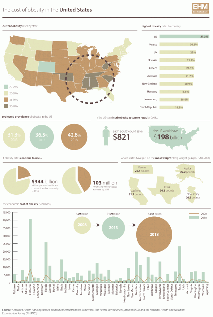
As you can see from the Executive Healthcare Magazine-designed infographic, obesity is expensive! Even if you are not obese and happen to have access to all of the most fresh and healthy food, there are number of reasons why this might be important to you. For instance, we pay for the health of our nation through tax contributions to medicaid and medicare.
This infographic, designed by weightlossdietwatch.com, sheds lights on the impact of poverty on the health high school students. It also underscores the as costs of obesity to the U.S. budget
Haven’t had your fill of obesity visualizations? Check out submissions to GOOD Magazine’s project: Create An Infographic About Childhood Obesity.


