centers for disease control and prevention
User interface and data visualization design firm FFunction created this infographic to visualize the severe decline of the honey bee population (Colongy Collapse Disorder) over th[...]
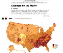
This interactive visualization by SlateLabs demonstrates the rise in diabetes diagnoses among adult Americans. Slate used data from the Centers for Disease Control and Prevention t[...]
18 Feb 2025
, 0 Comment
17 Dec 2024
, 0 Comment
Copyright © 2015
Food+Tech Connect. All Rights Reserved. Made in New York.


