How long is your commute to the nearest grocery store? I have one at the end of my block in New York City, but there are certainly many neighborhoods in the City where fresh food is less accessible. And growing up in the South side of Chicago, there were a handful of options within a mile of our house but, again, that’s not the case in every neighborhood. And then there are places that are largely rural or desert, like Montana, Wyoming or Nevada, with small populations.
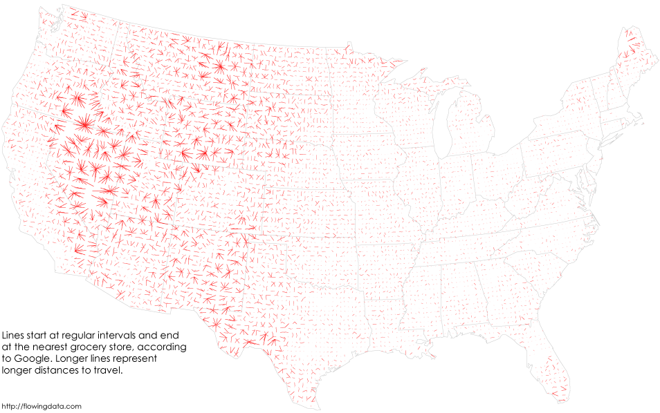
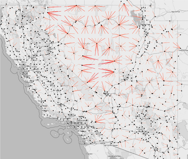
A new data visualization by Nathan Yau of FlowingData maps food deserts – urban neighborhoods and rural towns without ready access to fresh, healthy, and affordable food – across the United States. Leveraging data from the Google Places API, the visualization plots the distance to the nearest grocery store (both chains and smaller stores) at 20 mile intervals with a 10 mile radius. The dots represent grocery stores and the lines represent the distance between a town and a grocery store. Shorter lines represent an abundance of grocery shopping options, while longer lines and starbursts represent few grocery options.
The visualization shows that 36 percent of residents across the country do not have a grocery store within 10 miles of their home, while the median distance nationwide is 7 miles. It is important to note that the data is based on geography rather than population density. While Yau’s visualization sheds light on a serious national problem, it does not hone in on urban areas, where food desserts are prevalent. He makes note that other considerations such as income, zoning, and food price are factors he has yet to explore.
You can view the complete set of data visualizations here.
Check out a few of our recent infographic features:


