 [Editors Note: This post includes 1 of 5 infographics looking at how, where , what, when and with who people eat. The remaining infographics can be found here.]
Last February, Massive Health raised $2.5 million in seed funding to help people improve their health through better data, design, social and game mechanics. Their goal has been to bridge the world’s of healthcare and consumer products, using mobile phones as sensors that collect real-time data about a user’s behavior. The company wants to analyze the data collected to tighten the feedback loop for patients of chronic diseases and help them improve their behavior.
Their first experiment with this is The Eatery, an iPhone app that helps users track and analyze their eating patterns to better understand their strengths, weaknesses and the best places to make changes in their diet. Users snap photos of their food, and then rate its health on a scale from “Fit” to “Fat.” Users then receive crowdsourced feedback on the healthfulness of their eating habits from community members.
Collecting large-scale, real-time data about people’s diets, not just self-reported details about their eating habits, is nearly impossible. Yet, this data could help us and the medical community better address the rising obesity and diabetes epidemics. Over the past 5 months, Massive Health has collected over 7.68 million food ratings from people in 50 countries. Today, they are releasing some of their key findings about how people think they eat (and how healthy they actually eat), where people eat, what they eat, when they eat, and who they eat with, as a series of infographics.
But can crowdsourced data be trusted?
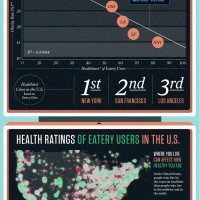
“Famously, one of the most accurate ways to guess the number of jellybeans in a jar is to average the guesses of everyone in the room,” writes Massive Health co-founder and Chief Vision Officer Aza Raskin on the company blog. “The crowd-sourced method beats much more advanced algorithms. To test our hunch that the same applied in nutrition, we looked at the aggregate Eatery scores for all meals eaten in a city versus the published obesity level in that city. It turns out there’s a strong correlation. Eatery data can accurately predict obesity levels of cities in the United States. That is, Eatery data strongly correlates with the healthiness of its users.”
Massive Health has broken the infographics into five parts. Below is the infographic detailing how healthfully we think we eat. Click here to be directed to the infographics on when, where, what, and with who people eat.
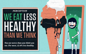
One of the interest key findings is that people eat 12.4 percent less healthy than users actually think they do. In fact, the less healthy the food is, the less accurate users tend to rate it. Pizza, for example, is rated 2.8 times less healthy by others than by the user.


