 Yesterday, I discussed the method for us to access our Google Doc data. Today I am going to speak of what we call the “presentation layer.” This layer is the actual webpage that viewers see, the map that is on it, and the styling of the data that is viewable.
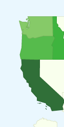
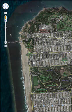
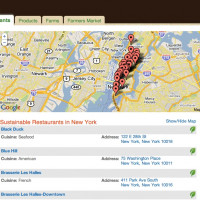
To show a map of the country, we again turned to Google, but not with the map most people are most familiar with. The traditional Google map that most people embed on their websites, while extremely powerful, has some small issues: it is not visually appealing, and it is overly complex unless you are, in fact, trying to find roads, waterways, or even need to zoom down to the street level. We didn’t need that. What we needed was something visually appealing, something clean, and most importantly something easy to use. Enter the Google GeoMap. If you use Google analytics, you will be familiar with this map. What it provides is a very clean interface. The user clicks on a state, and the API displays data for that state. If there’s no data in that state, it is shown in a color that lets the user know the “container is empty.”
 Now, to recap: we have our data in Google Docs. We have our ability to connect to the data via HTML, Javascript, and the Google visualization query API. At this point, we were ready to display the data to you, the user. Once all the data is pulled in from a query, it can be used to populate the map. This is done by loading the returned data into a datatable (an in-memory version of data; think a Google spreadsheet but stored in memory, for only a short amount of time) We now bind this data to the map, and presto! – the map has data for each state, including a count of how many data records are in each state.
I could stop here, but showing a map that lists the count of food sovereignty ordinances in a state is not very helpful – we wanted to show the user more information. To do this, I programmed it so that when a user clicks on a state an event is fired. This event grabs the data for that state from Google Docs via a JavaScript AJAX callback using our Google Visualization API, and we display it below the map. The framework for showing data to users in now in place, and the final step in this process is to display it. While a major goal of the project was to just get the data out there in a usable format, there is a certain professional style and look to the Grown in the City website, and we wanted to incorporate this “brand” into our map pages.
Tomorrow, I will talk about this final step – how I integrated our map pages into the CSS style sheets. This way, if you integrate one of these maps into your own website, it will look like the application is an integrated part of your website, and not thrown in as an after thought.
Come back tomorrow when I talk about how to use CSS styling to integrate the map right into your website.
This post originally appeared on Grown In The City.
___________________________


