As a new blogger, I never anticipated that our Visualizing our Food System post would spread so virally. It was incredible to see the response it provoked from people across a range of interests and varied demographic characteristics. Many of you commented that the graphic is complex, overwhelming, and difficult to navigate. These reactions are quite appropriate given that the very system which the map attempts to represent is in actuality all of those things.
I believe a large portion of the current issues we face stem largely from inefficiencies in the coordination, communication, information, and a concentration of power. Information is powerful because we rely upon it to make decisions that often affect much more than just ourselves. Historically, decision-making paradigms have been top-down with regard to what is considered expertise and how information flows within society. However, social networking and the blogosphere are radically changing these frameworks by empowering all citizens to share knowledge and have their voice heard.
The rapid and wide spread dissemination of the Global Food System Map serves as a wonderful demonstration of the opportunities the real-time web and information technology provide to disrupt our broken system and democratize information.
Some Facts
After posting the visualization to our blog, I subsequently tweeted about it, posted it on Facebook, and sent an email through a food listserv of which I am a member. Thanks to a number of influencers, the image was viewed 3,200 times the first day making us the fastest growing WordPress.com blog that day, and was viewed approximately 7,000 times in total the first week (to provide some context, our previous record number of views per day was 76).
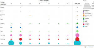
Over the course of the week, 2,790 of the visits were referred to the site via some form of social media. The chart to the left provides a more in depth understanding of the traffic flow based on social media network.
- The ability of information technology to disseminate information quickly through a network of similarly interested individuals. For example, when food system author Michael Pollan tweeted about the visualization, it brought 186 of his followers to our site in the first week. His link of the day post referred 286 more individuals to our site.
- The implicit relationships that result from the exchange of knowledge represent a potentially powerful tool for making data and concepts more personal and relevant. People are much more likely to change their actions when challenges become relevant to their lives and the lives of their community.
- The map spread through a variety of different interest areas including food, agriculture, technology, sociology, and economics. One unexpected and fascinating trend to note is that in the first week the map was accessed 451 times through technology blogs that focus on infographics and 488 through food related blogs. This almost equal distribution further demonstrates the potential for spread of information based on relevancy to one’s personal interests.
- The web is democratizing information and changing the way information flows by making it dynamic and interactive. Each person that viewed and passed along the post became involved in an intricate network of influencers and knowledge sharers. Citizens are now able to interact with and form alliances around information. Once this reaches critical mass, it creates an opportunity to begin effecting policy change.


