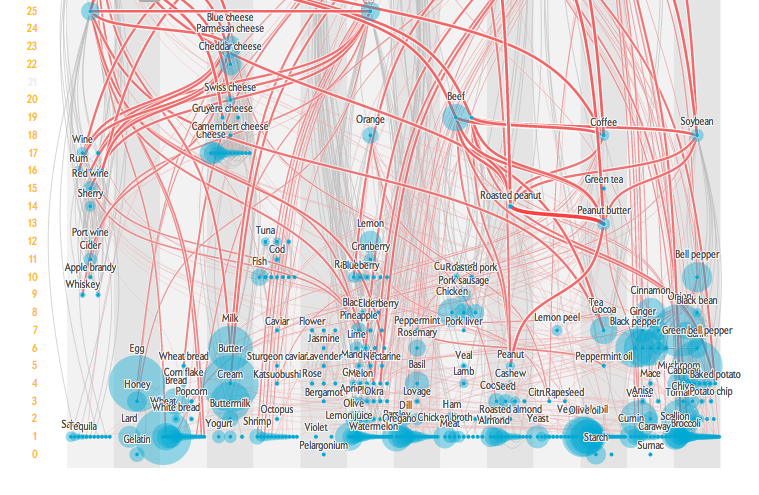
Ever wonder why cooking chicken always seems less desirable than preparing a juicy steak or why wine and cheese are a match made in heaven? The answers to such food pairing queries may lie in a new interactive infographic created by Jan Willem Tulp for this month’s Scientific American food issue, derived from Yong-Yeol Ahn’s Flavor Network and the Principals of Food Pairing.
The infographic illustrates a family tree of commonly consumed foods. Using databases of over 56,000 recipes world wide, it ranks foods hierarchically by the number of flavor compounds they share (food relatives) with other foods and highlights the most common foods. The more compounds foods share, the thicker the red line connecting them, while gray lines indicate other foods in the same category, i.e. meat, dairy, herb, plant, spice etc. The visualization brings to light some unlikely relatives, like tuna and coffee or cinnamon and parmesan cheese, as well as more intuitive relationships, such as rum and pineapple.
Ahn and his team originally created the flavor compound map in order to determine whether there are any patterns that dictate ingredient pairings and to test the hypothesis that ingredients sharing flavor compounds are more likely to pair well together. The team concludes that only western chefs tend to pair ingredients with similar flavor compounds. A database of recipes from East Asia revealed that dishes more commonly combine ingredients with desperate compounds.
Take a spin around the hunger-inducing visualization here and check out some of our previous ingredient data pieces.
Infographic of the Week: What’s in Your Hotdog
Mining Allrecipes.com’s Ingredient Newtorks for Recipe Reccommendations
Data Dive: Mapping the Cuisines of China


